IMGE is one of DC's leading digital marketing agencies and, over the course of a decade, had grown from a lean, mean 4-person start-up into an established 50-person operation with multiple verticals and specialties. Their branding, however, lagged far behind - they still used the same Times New Roman logo that their founder had typed in a word doc. I worked with company leadership on a full rebrand: a custom logo, visual identity system, illustration style, and website. I've also filled the role of art director over the years, overseeing the creation of a veritable tsunami of social media content, print materials, and more.
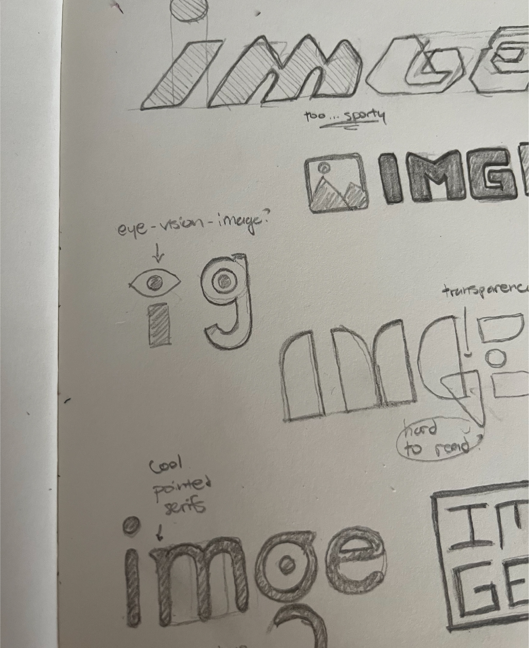
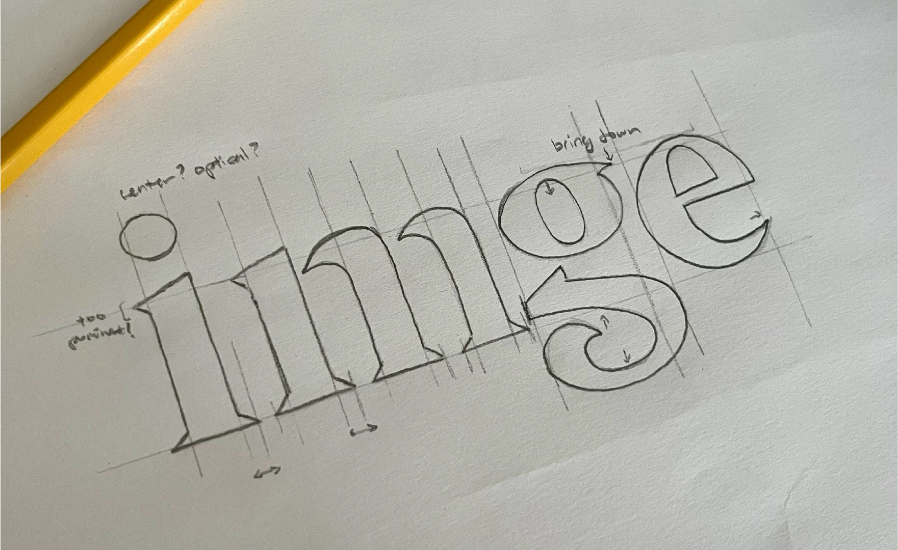
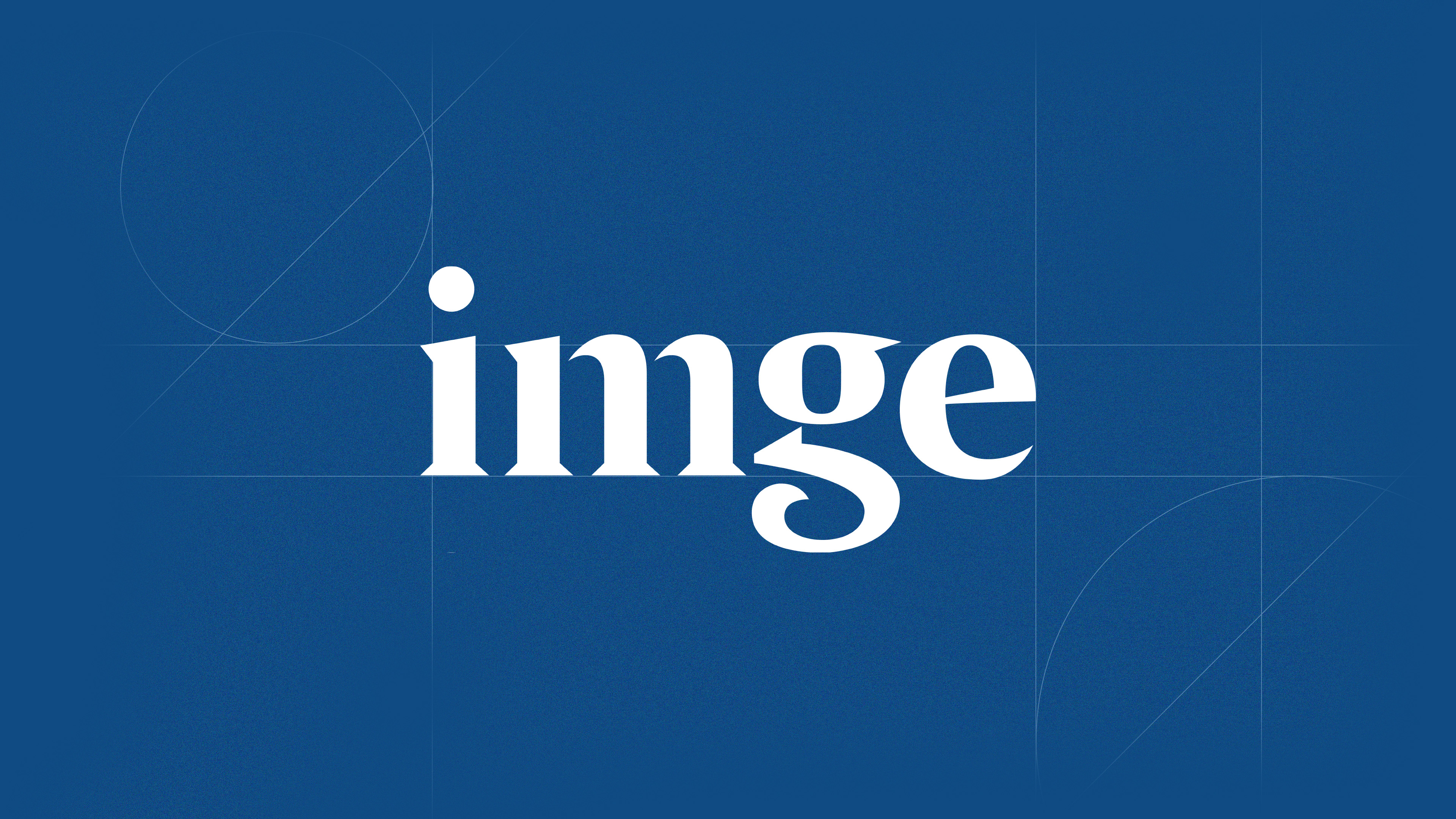
We kicked things off with an exploratory research phase: internal and external brand surveys, a competitor audit, and persona development. Based on these findings, we determined that the brand needed to be slick and professional, and ultimately bridge the sharp, modern world of digital marketing with DC's "jacket-and-tie" sensibilities. With this tension as our north star, we began ideating on the logo. We generated dozens (maybe more) of sketched directions, before arriving at a hand-drawn serif wordmark. The final mark is an homage to the original, Times New Roman mark but with some unique twists. The sharp, pointed serifs and unique 'g' bowl take something timeless and give it a bit of modern forward thinking.
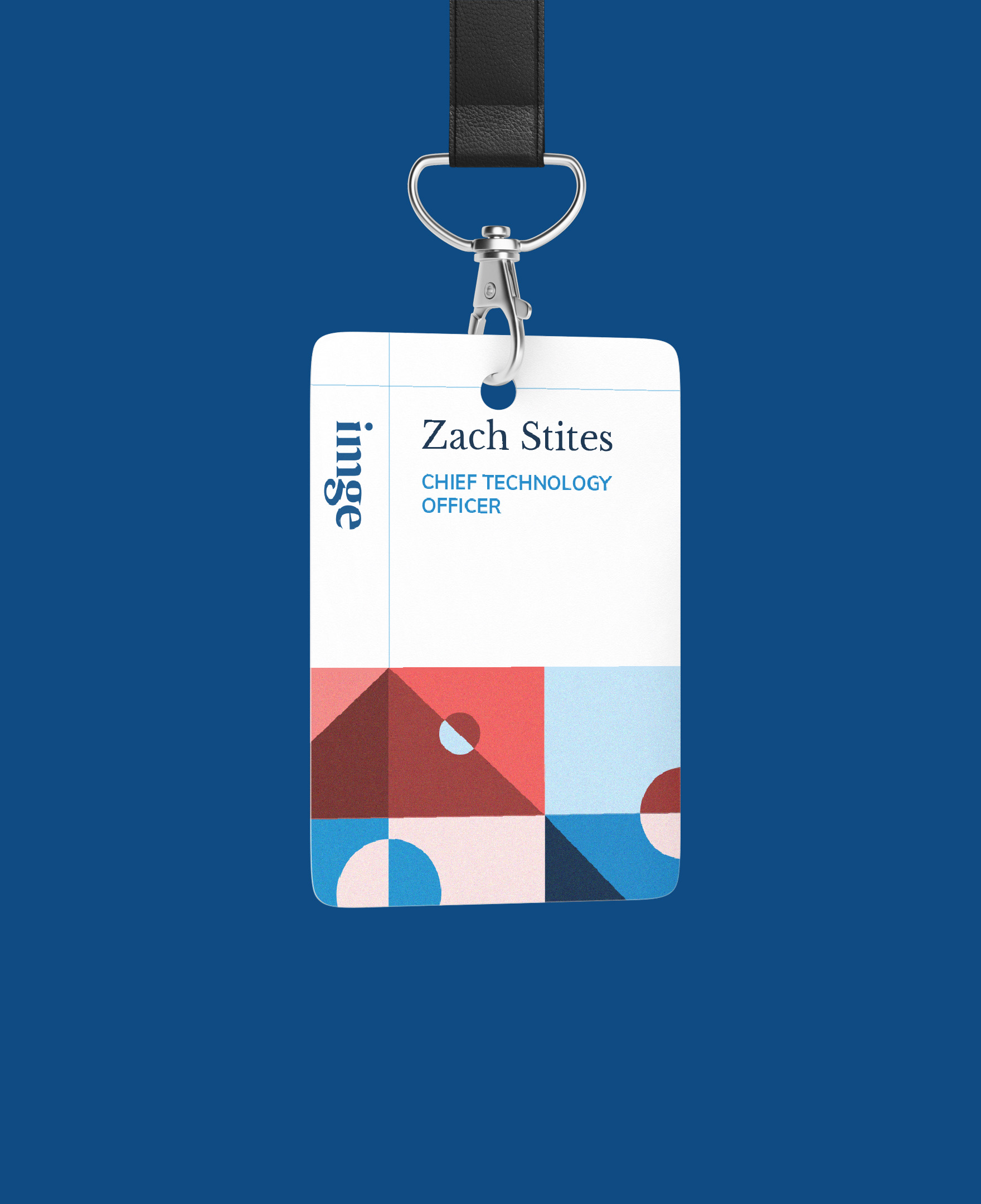
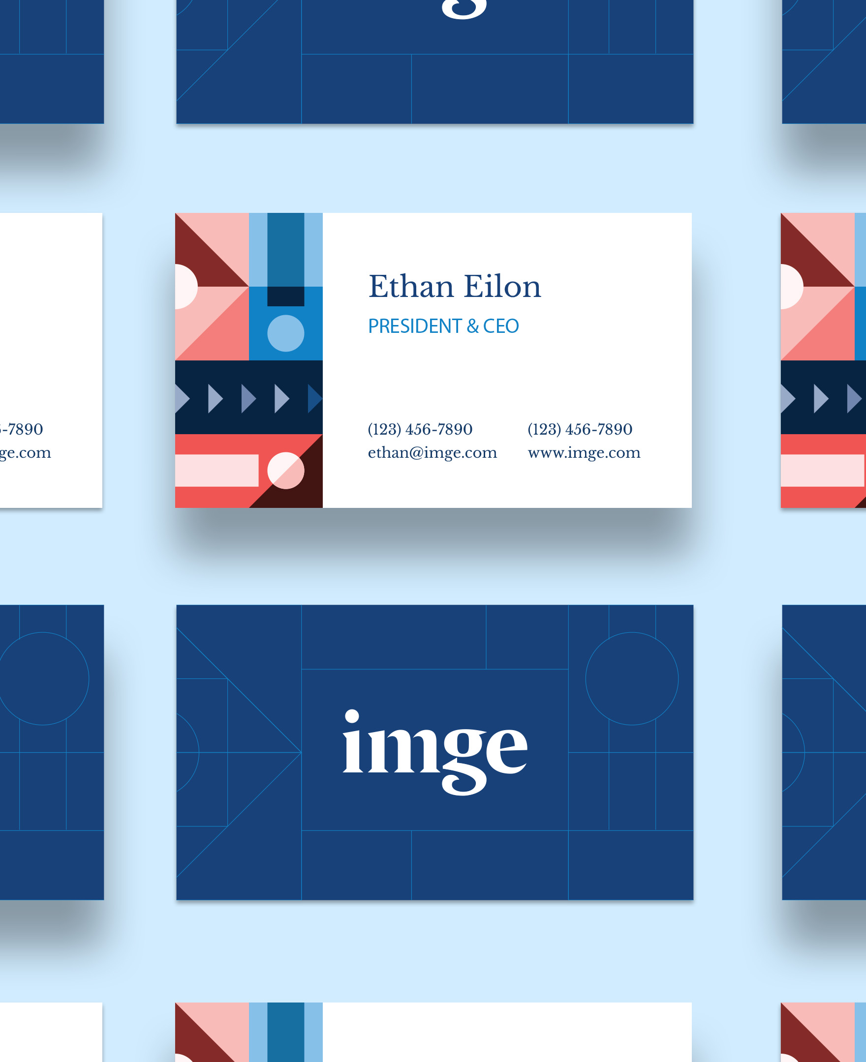
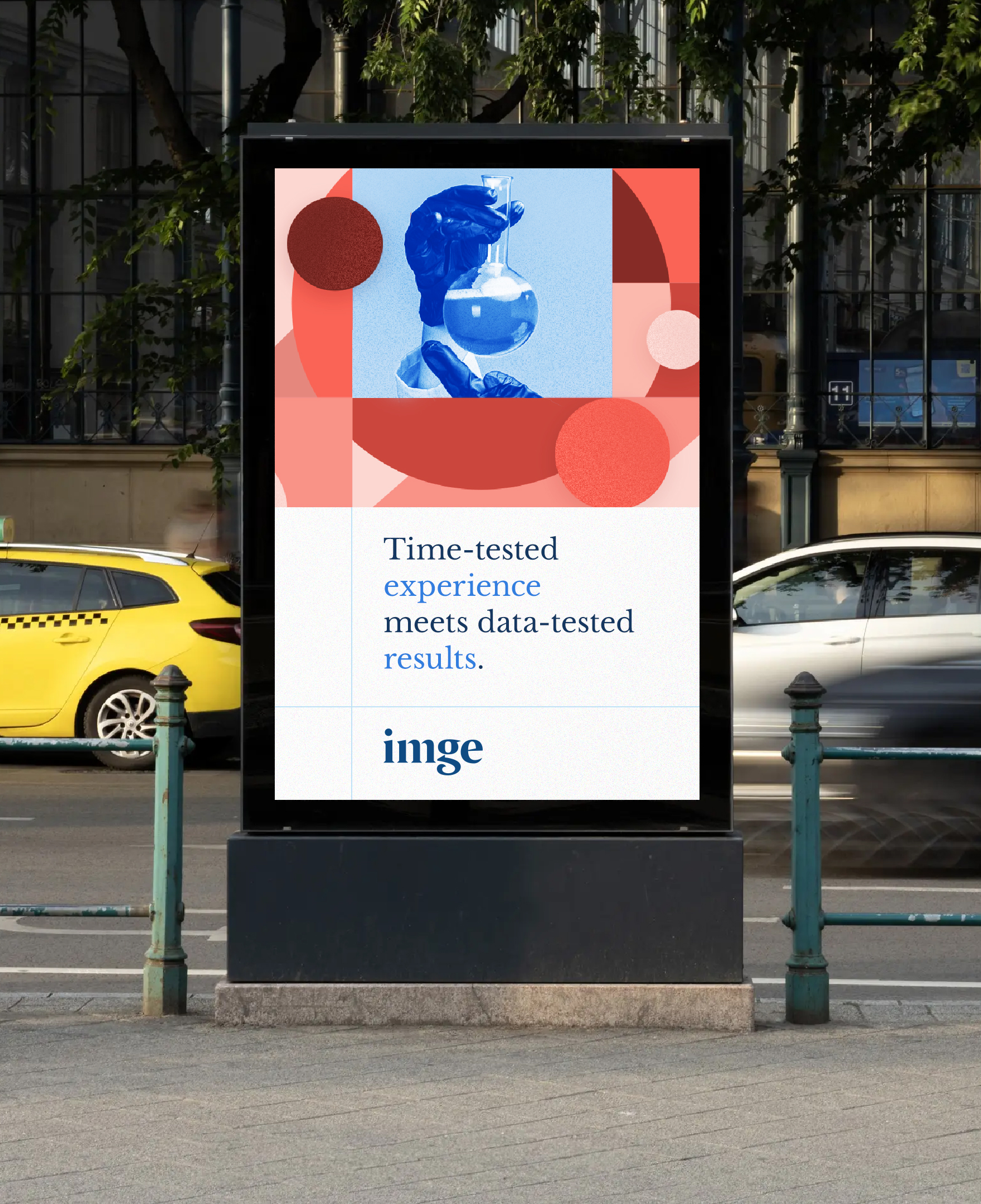
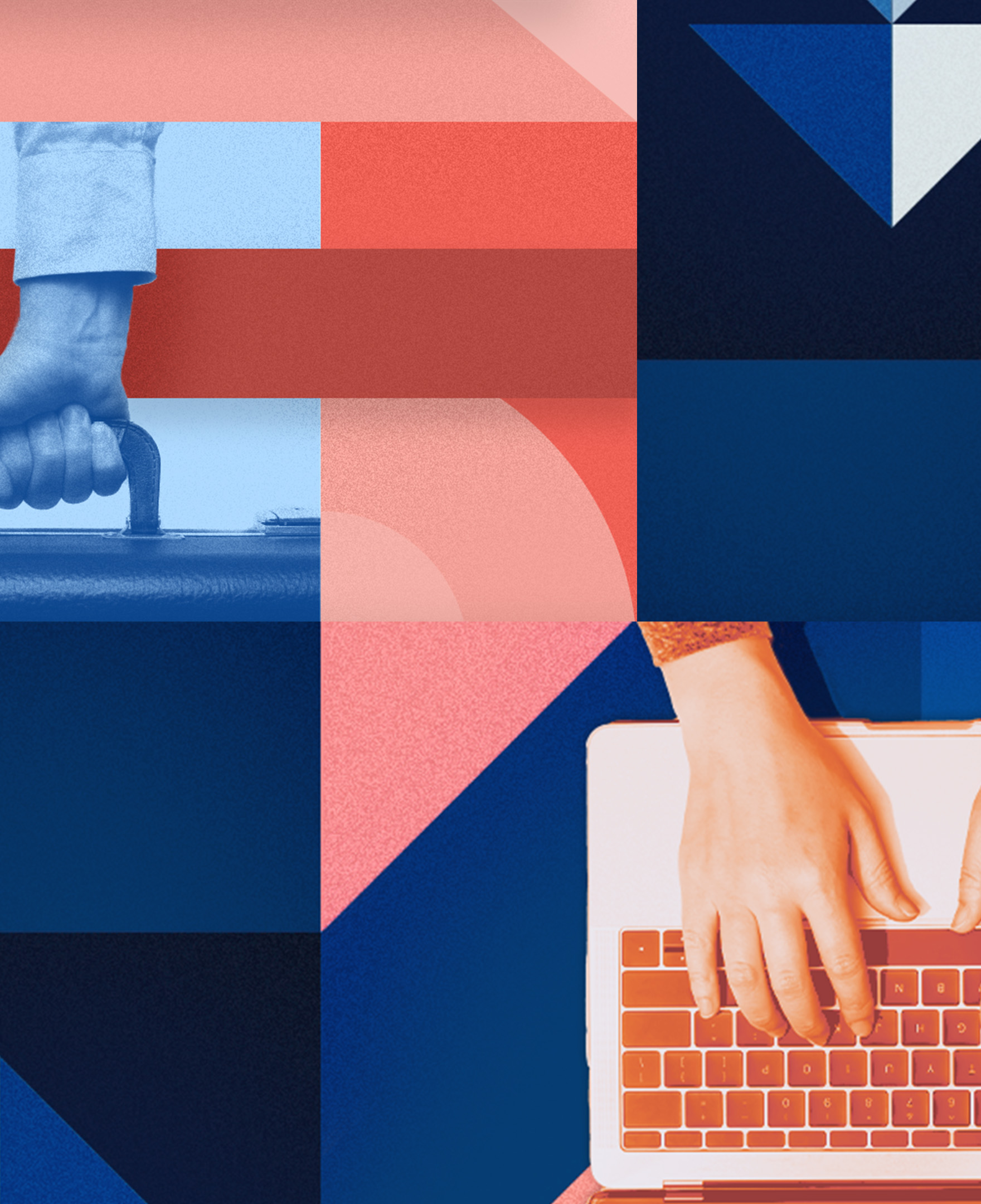
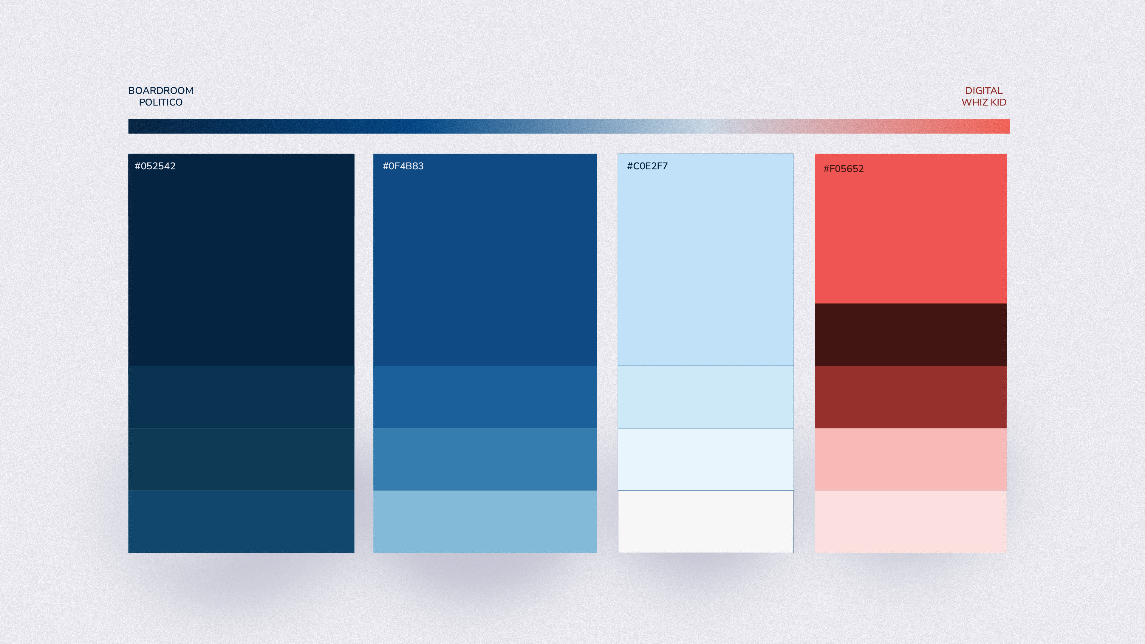
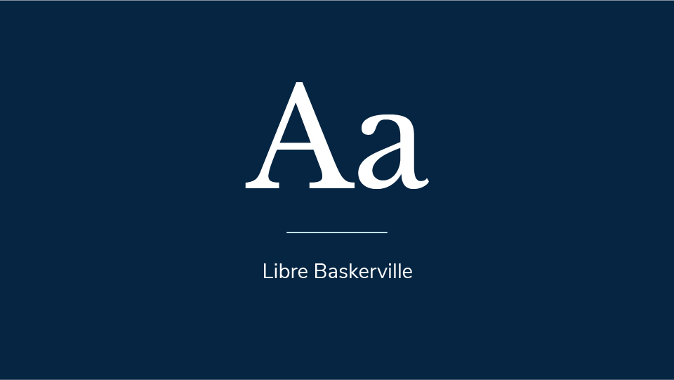
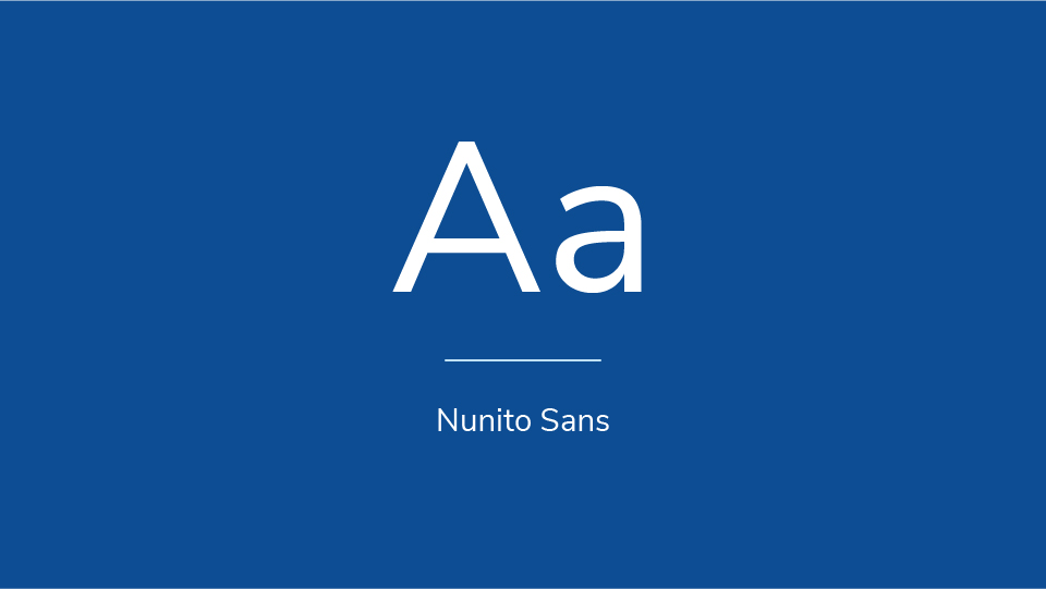
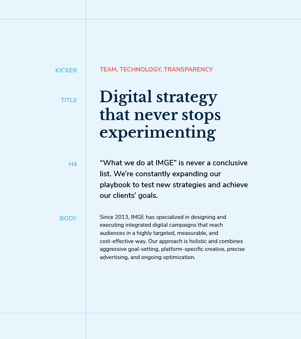
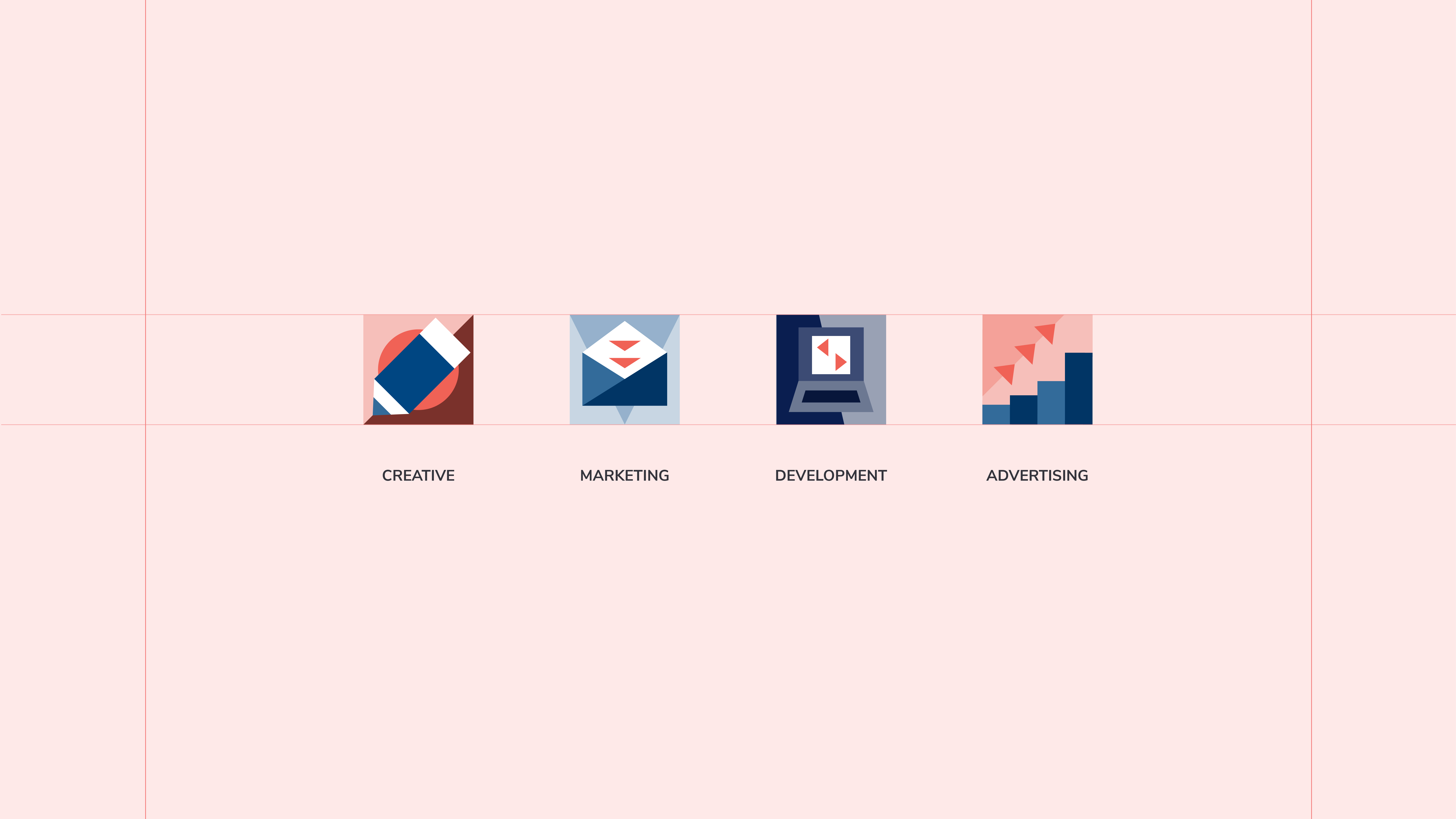
With the logo locked in place, we moved into building out the rest of the brand system. For color, we landed on a palette of deep, traditional blues, contrasted with some bright, punchy oranges. Fonts-wise, we paired Libre Baskerville for headlines with Nunito Sans for body copy. Both decisions tied back to our north star of old-meets-new. We also built out an illustration style and icon system consisting of overlapping geometric elements - reflecting how IMGE's overlapping specialties come together to form a cohesive product for its clients. This illustration system ended up doing a ton of heavy lifting and, paired with some spicy duotone images, made for some awesome, eye-grabbing spotlight imagery.
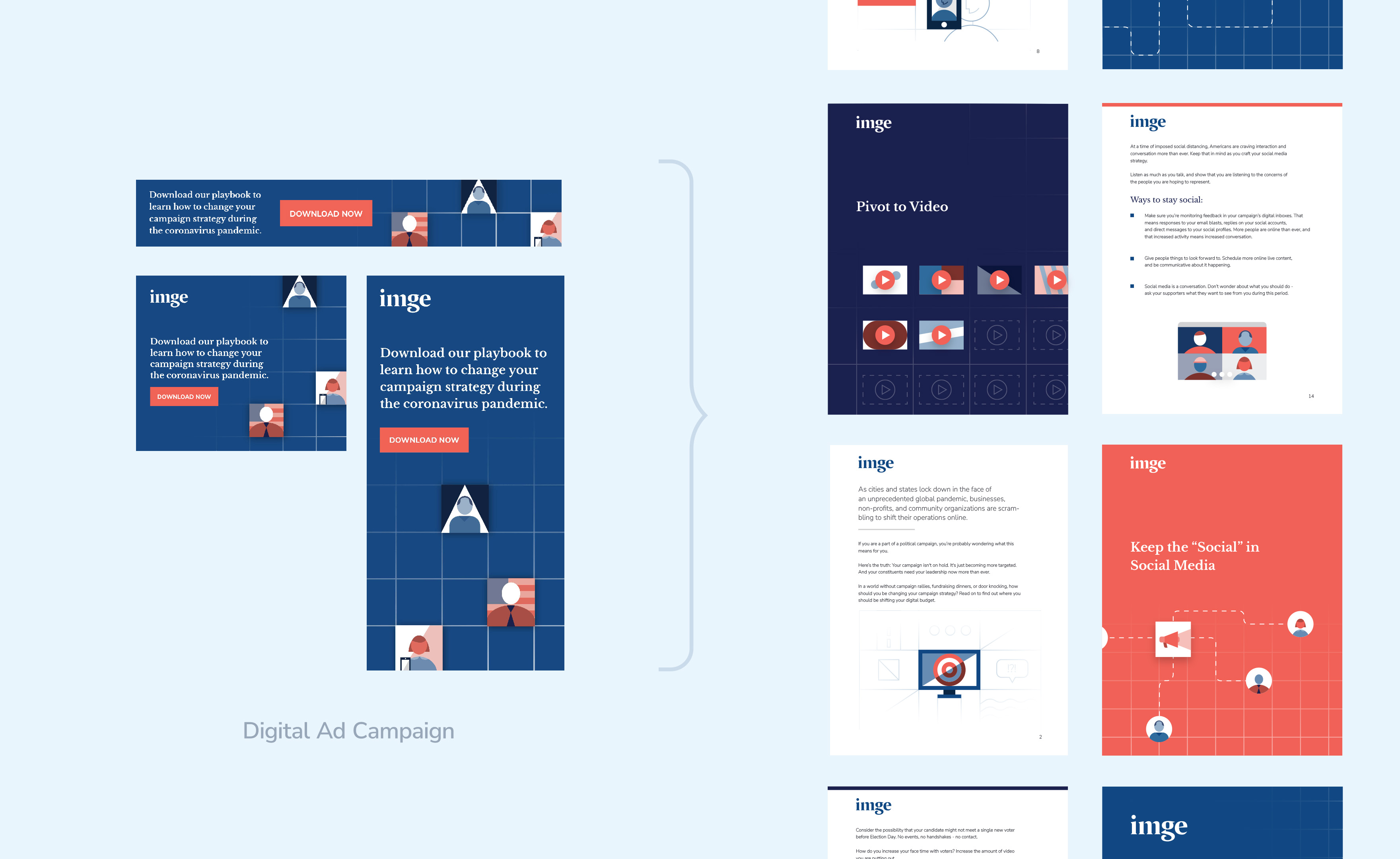
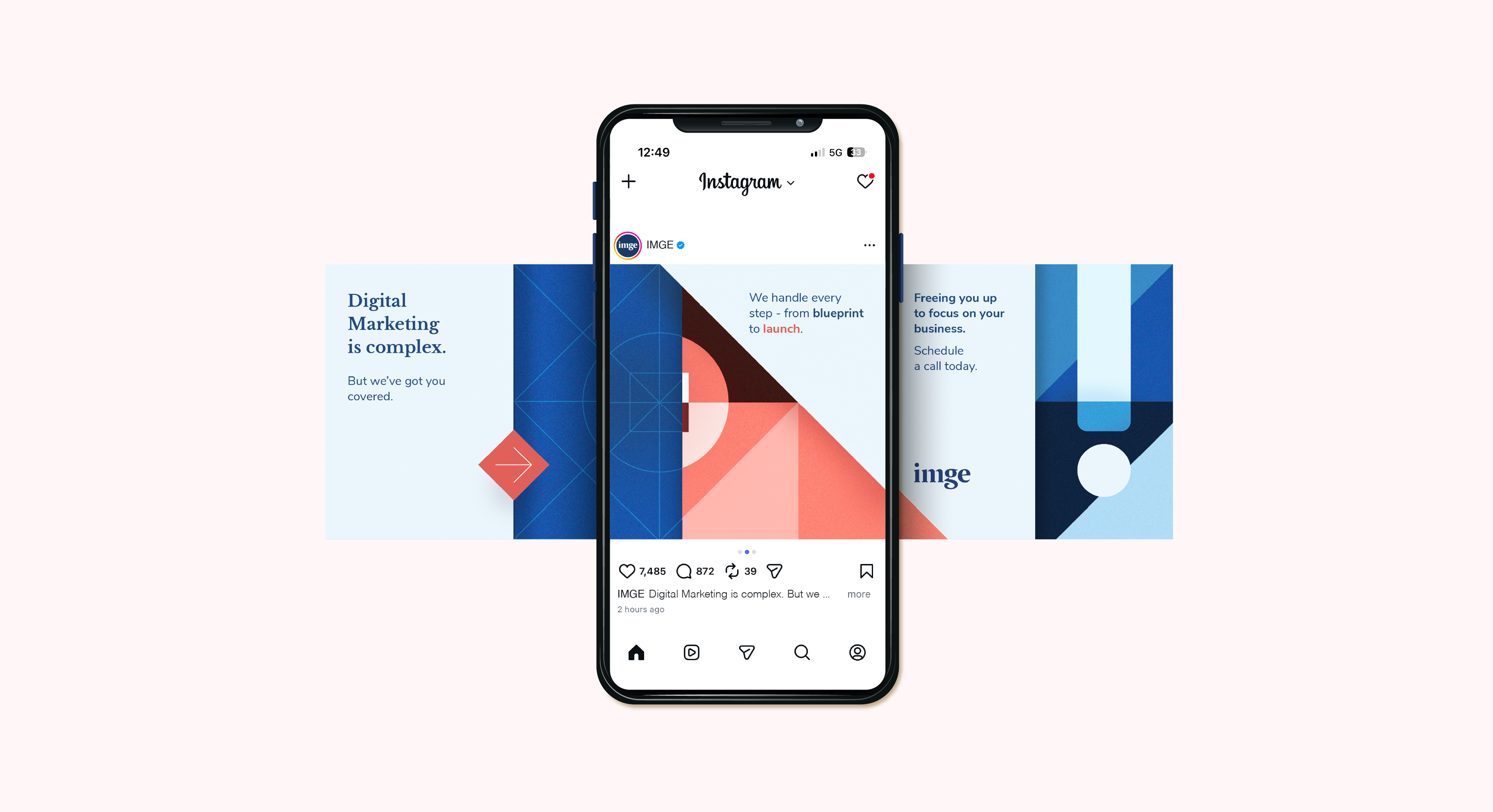
We put the brand system to work, using it to build a steady stream of outputs over the years: slide deck templates, print materials, social content, and more. The system we'd built gave us the flexibility to create assets that felt consistent across any number of touchpoints. A good example: a library of downloadable PDF resources for marketing professionals, paired with a full slate of promotional material like display ads - all built from the same IMGE building blocks, so everything felt "of a piece."